 12 min read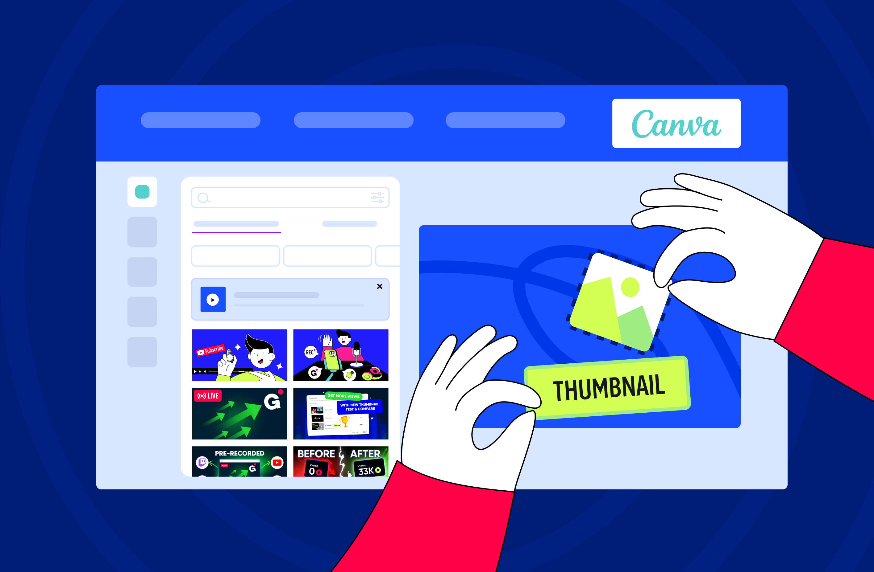
TL;DR
- YouTube recommends exporting a custom thumbnail at 3840 × 2160 pixels in a 16:9 ratio, with 640 pixels as the absolute minimum width. The familiar 1280 × 720 still uploads without an error, but it now works as a floor rather than a target.
- Supported formats are JPG and PNG. WebP is not on YouTube’s list, even though Canva will happily export one.
- File size caps depend on where you upload from: 2 MB on a phone, 50 MB on a computer.
- Canva’s free plan is enough for a professional thumbnail. The YouTube Thumbnail template is already the right shape, and premium elements are marked with a crown.
- Magic Media and Dream Lab generate images inside the editor on the free plan within a monthly allowance of AI uses. Magic Resize and unlimited background removal sit behind Canva Pro.
- A/B testing in YouTube Studio, which most creators still call Test & Compare, runs up to three thumbnails and picks the winner by watch time share rather than by clicks.
YouTube thumbnail size and format in 2026
Export at 3840 × 2160 pixels in 16:9, save the file as JPG, and keep it under 2 MB if you are uploading from a phone. Two of those numbers changed in YouTube’s own documentation, which is why most Canva tutorials still tell you 1280 × 720 is the target.
Here is what YouTube’s current guidance on custom thumbnails asks for:
- Resolution. 3840 × 2160 recommended, 640 pixels the minimum accepted width. Anything smaller gets scaled up and reads as soft on a TV screen.
- Aspect ratio. 16:9 for regular videos and live streams, 9:16 for Shorts, 1:1 for podcast playlists.
- Format. JPG or PNG.
- File size. 2 MB from mobile, 50 MB from desktop. Podcast thumbnails get 10 MB on mobile.
- Account. Custom thumbnails require a verified account, and every channel has a daily upload limit that varies by region and channel history.
One rule catches vertical uploads. When a vertical video carries a 16:9 custom thumbnail, YouTube swaps in an auto-generated 4:5 crop on the home, explore, and subscriptions pages, and your image still shows on the watch feed, in watch history, and on non-mobile platforms.
Canva’s YouTube Thumbnail preset opens at 1280 × 720, which matches the old standard rather than the current recommendation. Raise the export size in the download panel before you save the file, or start the design on a custom 3840 × 2160 canvas.
Find a thumbnail template in Canva
Open Canva’s YouTube thumbnail editor in the browser or the mobile app and pick the YouTube Thumbnail format. You get a blank canvas in the right proportions and a template list on the left of it.
Type a few words into the template search instead of scrolling the whole catalog: a topic, a mood, or a format such as podcast, vlog, or stream. The filters for style and color narrow the list further. What you are looking for is a layout whose text block and photo slot match the material you actually have, not the prettiest image in the row.
Stream covers follow a different set of constraints, because YouTube prints a red LIVE marker over them and the same file becomes the replay thumbnail afterwards. Our guide to thumbnails for live streams covers what changes there.
Customize your thumbnail
Every element on the canvas is editable. Double-click the text to change the wording, the typeface, and the color; swap the template photo for your own upload or a library image; move, recolor, and layer anything that sits on the canvas. Keep the headline to three to five words, because a full sentence collapses into grey texture the moment the image shrinks.
Then check the design at the size it will actually be served. Shrink the editor window in the browser until the canvas is about 120 pixels wide, or open the same design on your phone through your Canva account. Whatever survives that test is the thumbnail, and the rest is decoration nobody sees.
Canva’s AI tools for thumbnails in 2026
Canva groups its AI features under Magic Studio, and for thumbnail work they split cleanly into what the free plan covers and what it does not.
- Magic Media and Dream Lab turn a text prompt into a background or a single element directly on the canvas. Canva marks both as free features, with a monthly allowance of AI uses that resets each month; the company publishes multipliers rather than a fixed credit count for the free plan, so plan on a handful of generations rather than an open tap.
- BG Remover strips the background from a photo in one click, which is the tool you reach for most when a face carries the thumbnail. Canva sells unlimited use of it as part of Pro.
- Magic Resize takes one finished design and produces the channel banner and social announcement versions of it. It is a Pro feature, so on the free plan you duplicate the design and resize the canvas by hand.
Generated backgrounds carry a cost that shows up later. When thousands of creators prompt the same model for a shocked face and a red arrow, the output stops distinguishing anyone, and a channel built on it becomes harder to recognize in a feed. Our breakdown of AI thumbnails on YouTube compares the tools and the policy side of using them.
Export your design
Click Share in the upper right corner, choose Download, pick the file type, and save it. In the mobile app the flow is shorter: tap Save once the design is finished and the file lands in your gallery.
Choose JPG for anything photographic, which is most thumbnails, since it keeps the file small enough to clear the mobile limit without visible loss at feed size. Choose PNG when the design leans on flat graphics or small type that has to stay crisp, and check the file size afterwards.
Thumbnail elements: common mistakes and what to do instead
Most weak thumbnails fail on the same five decisions, and all of them are fixable in Canva before you upload anything.
| Thumbnail element | Common mistake | Best practice for CTR |
|---|---|---|
| Text | Too many words in a light typeface that vanishes at feed size | Three to five short words in heavy, high-contrast type, readable at around 120 pixels wide |
| Face and emotion | A neutral expression, or no person in the frame at all | One legible emotion, cropped tight enough to read at a glance |
| Color contrast | A palette that sits in the same register as the videos around it | Two or three dominant colors that separate from both the light and dark YouTube interface |
| Bottom-right corner | Key text placed where YouTube prints the duration badge | Leave that corner empty and keep anything readable in the upper two-thirds |
| File format | A heavy PNG uploaded out of habit, or a WebP that YouTube rejects | JPG for photographic thumbnails, PNG when text or flat graphics have to stay sharp |
Click-through rate (CTR) is the share of impressions that turn into clicks, and it responds to a short list of repeatable design decisions rather than to talent.
Pre-upload checklist
Run the finished file through this before it goes anywhere near YouTube Studio. A minute here saves the awkward re-upload two hours after publishing.
- Exported at 3840 × 2160 in 16:9, or at minimum above 1280 × 720
- Saved as JPG, or as PNG when the design depends on text and flat graphics
- File under 2 MB if the upload happens from a phone
- Headline cut to three to five words and still legible at phone size
- One focal point, with a readable emotion if there is a face in the frame
- Bottom-right corner clear of anything that has to be read
- Image honest about what the video delivers, with no promise the content does not keep
Test your thumbnail before you commit to it
You do not have to guess which of your drafts works. A/B testing in YouTube Studio, the feature most creators still call Test & Compare, runs up to three thumbnails, titles, or combined packages against each other at the same time and applies the variant with the highest watch time to all viewers.
Watch time share, not clicks, is the deciding metric, which means a thumbnail can post the best click-through rate in the test and still lose it. YouTube’s reasoning is that packaging which oversells the content wins the click and then loses the viewer.
The eligibility rules are narrow enough to check first. The tool is desktop only, Advanced Features must be enabled on the channel, and Shorts, scheduled live streams, unconverted Premieres, private videos, and anything marked for kids or mature audiences are excluded. Tests wrap within two weeks and come back as Winner, Performed Same, or Inconclusive, and the last two are normal outcomes rather than a failure.
For setup, impression thresholds, and how to read the report, see our walkthrough of YouTube’s title and thumbnail A/B testing.
Consistency matters more the longer an image stays in circulation. If you broadcast pre-recorded video as a 24/7 live stream with Gyre on YouTube, Twitch, or Kick, the stream preview competes in the same feed as regular uploads around the clock, so one reusable Canva template with a single variable slot does more work than a fresh design per video. Several streams can also run from one video library, each with its own title and thumbnail, which turns that template into a set of variants worth comparing over time.
Key Takeaways
- Save the design you settle on as a Canva template with one slot that changes per video. Recognition builds across a channel, and it builds faster than any single thumbnail performs.
- Re-export your recent thumbnails at 3840 × 2160. The files uploaded at the old 1280 × 720 standard still work, and they will look soft on the TV screens where a growing share of watch time now happens.
- Pick one older video with strong retention and weak CTR and run a single A/B test on it this month. That is where the packaging is mis-selling content that already delivers.
- Keep JPG as your default export and leave WebP for your website. The 30 seconds you save on file size are not worth a failed upload.
- If your channel also runs a continuous stream, apply the same template to the stream preview. It sits in feeds around the clock, which makes it the hardest-working image you own.
FAQ
What size should a YouTube thumbnail be?
YouTube recommends 3840 × 2160 pixels at a 16:9 ratio, with 640 pixels as the minimum accepted width, in JPG or PNG. Keep the file under 2 MB if you upload from a phone; from a computer the cap is 50 MB. Canva’s YouTube Thumbnail preset opens at 1280 × 720, so raise the export size in the download panel before you save.
Can I make a YouTube thumbnail in Canva for free?
Yes. The free plan includes the correctly sized template, the editor, and enough fonts, photos, and graphics to build a professional thumbnail without a subscription. Premium items are marked with a crown, and most of them have a free equivalent a search away.
How do I make a thumbnail with a high CTR?
Use three to five words in heavy, high-contrast type, one face with a readable emotion, and colors that separate your image from the videos next to it in the feed. Keep the bottom-right corner clear, because YouTube prints the video duration there. Then check the design at about 120 pixels wide, which is closer to how most viewers will see it.
Why should I not save a YouTube thumbnail as WebP?
WebP compresses better than PNG and is a sound choice for a website, which is why the advice keeps spreading. YouTube’s supported thumbnail formats are JPG and PNG, so a WebP file fails on upload. Export from Canva as JPG instead.
Can I test several thumbnails on YouTube?
Yes. A/B testing in YouTube Studio runs up to three thumbnails on one video and shows them to different viewers at the same time. The winner is the variant with the highest watch time share, not the one that collects the most clicks, and the test finishes within two weeks.