 15 min read

TL;DR
- YouTube recommends uploading a custom thumbnail at 3840 × 2160 pixels, 16:9, with a minimum width of 640 pixels, in JPG, GIF, or PNG.
- File size limits depend on where you upload from: 2 MB on mobile, 50 MB on desktop.
- YouTube draws its own overlay along the lower strip of every thumbnail: a duration badge on regular videos, a red LIVE marker while you broadcast. Keep text and faces out of that band.
- The thumbnail you set for a stream stays with the archive after the broadcast ends, so wording like “LIVE NOW” goes stale within hours.
- You can’t A/B test a scheduled live stream in YouTube Studio, but you can A/B test the live archive once it’s saved as a video.
- Studio picks the winning variant by watch time, not by clicks. Up to three options per test, desktop only, advanced features required.
- If any variant in a test sits below 1280 × 720, YouTube downscales every thumbnail in that test to 854 × 480.
- Ask Studio generates thumbnail suggestions from your video’s transcript and themes, and you can refine them with follow-up prompts.
- On a 24/7 stream, the thumbnail runs continuously. It works as your channel’s storefront rather than a one-off cover.
Live Stream Thumbnails vs VOD Thumbnails: What Actually Changes
A live thumbnail differs from a VOD thumbnail in three ways: YouTube adds a red LIVE marker over it while you broadcast, the same image carries over to the replay after the stream ends, and the specs it gets judged against changed in 2026. Each one narrows where you can put your text and how long the design stays accurate. All three land on click-through rate (CTR), the share of impressions that turn into clicks. Our guide to CTR on YouTube breaks down how the platform counts impressions and what a healthy rate looks like by niche.
YouTube’s overlay lands on top of your design
Every thumbnail in a YouTube feed carries platform-drawn elements you don’t control. Regular videos get a duration badge; a stream in progress gets a red LIVE marker instead, and on mobile a progress bar can cut across the bottom edge.
Treat the lower band of the frame as reserved space. Roughly the bottom fifth belongs to YouTube, with the bottom corners at highest risk, so anything that has to be read belongs in the upper two-thirds. Ignore this and you get a thumbnail that looks great in Canva and loses its key word behind a badge in the feed.
The badge has a second implication people miss: the platform already tells viewers you’re live. Baking “LIVE NOW” into the artwork duplicates a free signal and burns pixels you could have spent on the hook.
The live thumbnail becomes the replay thumbnail
Set a thumbnail on a stream and it follows the broadcast into the archive. Nothing about it changes when the stream ends, but the context does. A countdown, a date, or urgency language that made sense at 8 p.m. reads as abandoned by the next morning, and the archive is the version that keeps collecting views for months.
Design for the longer half of that lifecycle. Build the thumbnail around the topic rather than the moment, and keep two files if your live cover leans on urgency: one for the broadcast, one for the archive.
Thumbnail specs YouTube publishes for 2026
The numbers most guides still quote are out of date. Here’s what YouTube’s own documentation recommends now:
- Resolution: 3840 × 2160 pixels, with 640 pixels as the absolute minimum width. The old 1280 × 720 standard still uploads without error, but it’s a floor rather than a target.
- Aspect ratio: 16:9 for standard video and live streams; 9:16 for Shorts; 1:1 for podcast playlists.
- Formats: JPG, GIF, or PNG. WebP isn’t on YouTube’s supported list, so export elsewhere.
- File size: 2 MB when you upload from a phone, 50 MB from a computer. Podcast thumbnails get 10 MB on mobile.
- Account requirement: custom thumbnails need a verified account, and channels have a daily upload cap that varies by region and channel history.
Vertical streams carry one extra rule. When a vertical video has a 16:9 custom thumbnail, YouTube substitutes an auto-generated 4:5 crop on the home, explore, and subscriptions pages. Your custom image still shows on the watch feed, in watch history, and on non-mobile platforms. Our guide to thumbnails for YouTube Shorts covers the vertical format in full.
How to Design a Thumbnail That Earns the Click on a Live Stream
Your thumbnail is the first thing a viewer sees before deciding whether to open your stream, which makes it the most decisive asset you control on a platform as crowded as YouTube or Twitch. The principles below apply to any stream, from a one-off Q&A to a continuous broadcast. If you want the wider channel context around them, this article on effective marketing strategies on YouTube covers the rest of the setup.
Use text to inspire curiosity
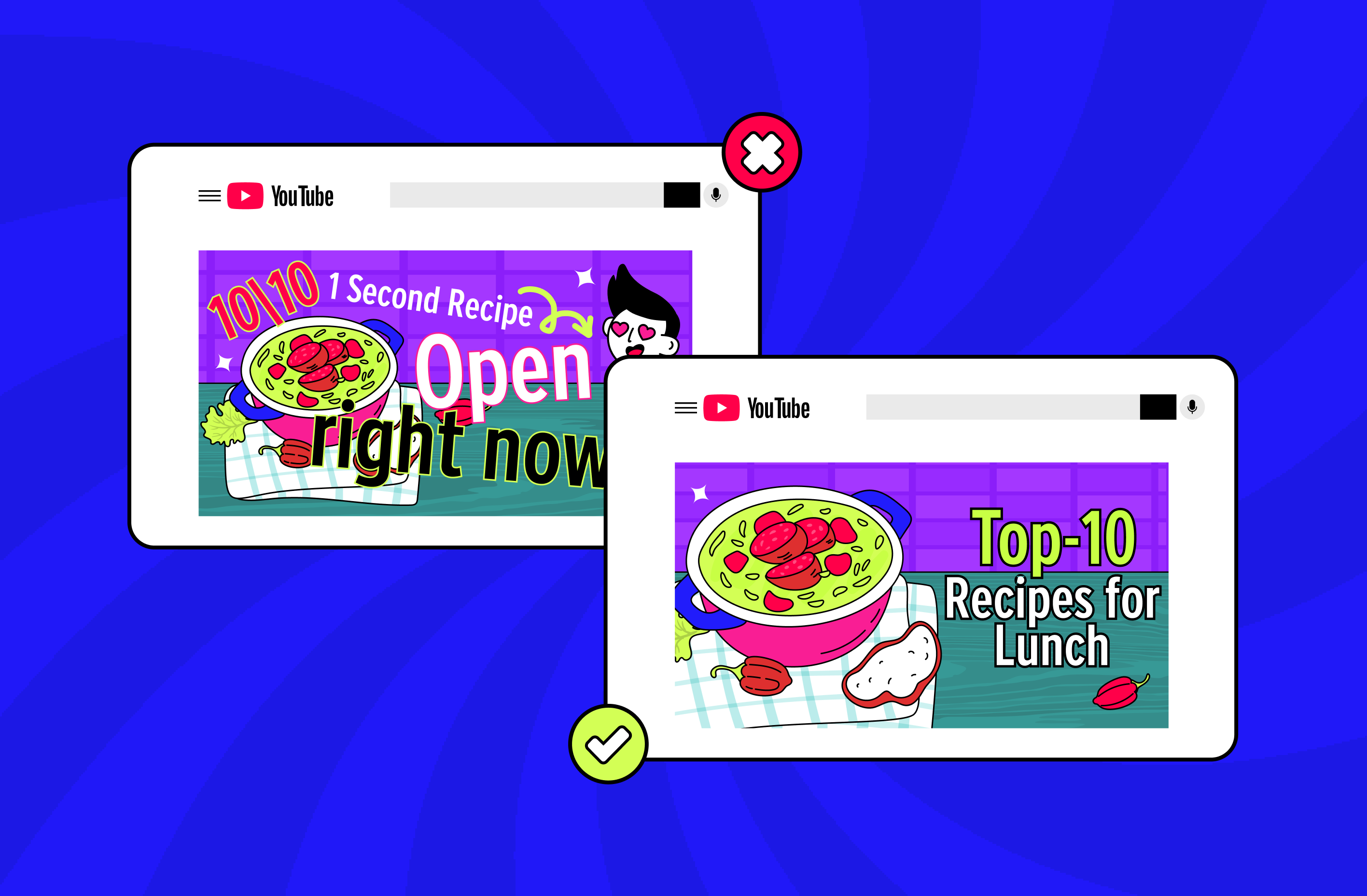
Text does the heaviest lifting on a thumbnail, so it needs to make someone want the answer. A provocative question or a teaser works: “What are game developers hiding?” or “5 mistakes in dough kneading that you make.” Stick to a simple formula of concise, readable text occupying no more than 20 to 30% of the image.
Two to four words is the working range for a live stream. Titles get truncated in the feed, so the thumbnail words have to carry meaning on their own instead of finishing a sentence the title started.
Choose bold, readable fonts
Fonts decide whether your text survives the shrink. Use clear, heavy typefaces that hold up on small screens, such as Impact or Montserrat, and skip decorative faces that turn to mush at feed size. Set type with the reserved lower band in mind: a headline running edge to edge along the bottom collides with the LIVE marker.
Maintain a consistent visual style for recognizability
Consistency across thumbnails is what turns a set of videos into a recognizable channel. Use the same color palette, typography, and visual language so your audience identifies your content before reading a word of text.
A template with one variable slot handles this well: fixed logo placement, fixed color pair, fixed type treatment, and a single area that changes per stream. You get recognition without redesigning every broadcast, and later testing means something, because one element changes at a time.
Match the visual cues viewers already expect
Viewers link topics to visual shorthand. Nature, world maps, or luggage in the background of a travel stream make the content feel aimed at exactly the person scrolling past, and genre cues do the same job on gaming, music, and cooking streams.
Use emotional reaction faces or human expressions
Thumbnails with faces tend to collect more clicks. Use a large, expressive face, whether it’s you or the main subject of the stream, and lean into legible emotion such as surprise, joy, or shock. Crop tighter than instinct suggests: a wide shot that reads fine on your monitor loses the expression entirely at feed size.
Analyze successful thumbnails in your niche
Study the top videos and their thumbnails in your content category. Note the recurring style, fonts, color schemes, and elements, then check what live streams in that niche do differently from the uploads.
Design specifically for small screens
More viewers reach live streams from a phone every year, so a thumbnail has to survive aggressive downscaling. Type and key elements need to stay legible after the image shrinks, and detail that only resolves at full size is wasted effort. Zoom your design down to thumbnail size before uploading; whatever disappears was never doing any work.
Skip the template look
Avoid stock layouts that make your stream indistinguishable from the four around it. Recognizable choices such as unexpected color pairings or an unusual shooting angle give each thumbnail its own identity while still fitting your channel’s system.
Use bright colors to drive attention
Red, yellow, and blue pull the eye fastest, so use them for emphasis rather than coverage. Keep the balance and avoid oversaturation, or the image reads as chaos. Contrast against YouTube’s interface matters as much as contrast inside the frame, since a white or near-black background disappears into light and dark mode respectively.
Eliminate unnecessary elements that don’t add value
Minimalism helps viewers land on the single idea your stream delivers. Cut anything that doesn’t contribute: heavy text blocks, spare graphics, a cluttered background. This pays double on a live thumbnail, where you already have less usable canvas than a standard upload.
Common Thumbnail Mistakes Beginner Video Creators Make
Five mistakes account for most weak live thumbnails: unedited screenshots, generic templates, text overload, clickbait, and promises the stream doesn’t keep. Each one is fixable in the editor before you go live.
Mistake #1: Using unedited screenshots as thumbnails
Raw screenshots look unfinished, and on a live stream they often catch a transitional frame with nobody facing the camera. Bring the image into an editor: lift the brightness, add text and supporting elements, and give it a focal point the original frame never had.
Mistake #2: Relying on generic or overused templates
Viewers tire of thumbnails they’ve already seen on ten other channels. Build a style that belongs to your content instead of reaching for the default layout your editor opens with.
Mistake #3: Overloading the thumbnail with too much text
Too much text makes a thumbnail unreadable at the size it’s actually displayed. Three to five words carry the point of a video; on a live stream, two to four work better.
Mistake #4: Using misleading click-bait tactics
Clickbait thumbnails that manufacture false emotion always disappoint. A celebrity who never appears in the stream costs you viewer trust, and YouTube’s own testing logic works against you here, because it rewards watch time rather than raw clicks.
Mistake #5: Making promises you can’t deliver
When a thumbnail sets an expectation the content doesn’t meet, viewers leave early and stop choosing your streams. On a continuous broadcast the damage compounds, because the same thumbnail keeps making the same promise to new viewers around the clock.
| Element | Common mistake | Best practice for live thumbnails |
|---|---|---|
| Lower band of the frame | Text or a face placed along the bottom edge, then hidden by the LIVE marker or duration badge | Treat the bottom fifth as reserved; keep readable elements in the upper two-thirds |
| Urgency wording | “LIVE NOW” or a countdown baked into the artwork | Let YouTube’s badge signal the live state; spend the space on the topic hook |
| Archive lifecycle | Forgetting the same image becomes the replay cover for months | Design a version that still makes sense after the stream ends, or swap it afterward |
| Upload resolution | Uploading a variant below 1280 × 720 before an A/B test | Export at 3840 × 2160 so no thumbnail in the test gets downscaled to 854 × 480 |
| Series consistency | A new layout for every broadcast, so nothing accumulates recognition | One template, one variable slot, fixed logo and color pair across every stream |
| Subject scale | A wide shot where the face and text collapse at feed size | Crop tight, check the design at thumbnail size before uploading |
Tools for Creating Live Stream Thumbnails
Canva, Adobe Express, Photoshop, Ask Studio and Pixlr cover every level of live thumbnail production, from a free template to full layer control. You don’t need a design background to use any of them.
- Canva. The usual starting point, with 16:9 presets, drag-and-drop editing, and a free tier that covers most needs. Its AI image generation builds backgrounds and base elements from a text prompt. Save your live layout as a brand template so every broadcast starts from the same file.
- Adobe Express. Free with an Adobe account, and stronger on typography and asset quality than Canva’s free tier. A good middle step if Canva feels limiting and Photoshop feels excessive.
- Photoshop. Full control over layers, masking, and color. Worth the learning curve once thumbnails become a weekly production task.
- Ask Studio, inside YouTube Studio. Generates thumbnail suggestions by reading your video’s transcript and themes, and accepts follow-up prompts such as making the text larger. Useful for a first draft on a stream archive, though the editorial judgment stays yours.
- Pixlr. A browser editor with nothing to install and a workable free tier, handy for quick fixes on a machine that isn’t yours.
For a fuller look at where AI-generated covers help and where they fall flat, see our breakdown of AI thumbnails on YouTube.
Test Your Thumbnails and Keep Them Consistent Across Streams
YouTube Studio’s A/B testing runs up to three titles, thumbnails, or combined packages against each other and declares the winner by watch time rather than clicks. A variant that wins clicks and loses viewers won’t take the test, which is the point: guessing gets you a thumbnail, testing tells you whether it works.
The live-specific catch sits in the eligibility rules. Scheduled lives can’t be tested, and neither can Shorts or unconverted Premieres. Live archives can, and that’s exactly the asset a stream leaves behind. So the sequence runs: publish with your best guess, wait for the archive, then test where the traffic keeps arriving. A few operational details:
- Desktop Studio only, and advanced features have to be enabled on the channel.
- Tests wrap within two weeks, returning Winner, Performed Same, or Inconclusive.
- Editing the title or thumbnail by hand mid-test stops the test, and you start over.
- Variants that differ by one word rarely produce a winner. Change the angle, not the adjective.
- YouTube suggests starting with older videos to limit the effect on channel-wide views while you learn what your audience responds to.
Our full walkthrough of YouTube’s title and thumbnail A/B testing covers setup, impression thresholds, and how to read the report.
Consistency matters more the longer a stream runs. On a 24/7 broadcast built from pre-recorded video with a tool like Gyre, which streams your existing library as a continuous live broadcast on YouTube, Twitch, and Kick, the thumbnail isn’t a cover someone glances at once. It sits in feeds around the clock as your channel’s storefront. Continuous streams also give you room a single upload doesn’t: several broadcasts can run from the same video library, each with its own title and thumbnail, which turns one template into a system worth testing against.
Key Takeaways
- YouTube overlays the lower band of every thumbnail with its own markers, so keep text and faces in the upper two-thirds and let the platform announce the live state for you.
- Consistent branding across live thumbnails builds the recognition that turns first-time viewers into repeat ones. One template with a single variable slot beats a fresh design per stream.
- High-contrast type and two to four words hold up at the sizes thumbnails actually display on a phone. Anything more disappears.
- On a 24/7 stream run through Gyre, the thumbnail runs continuously and works as your channel’s permanent storefront, not a single-use cover.
- The live thumbnail becomes the archive thumbnail. Design for both contexts, then A/B test the archive, since scheduled lives aren’t eligible for testing but saved ones are.
FAQ
What size should a YouTube live stream thumbnail be?
YouTube recommends 3840 × 2160 pixels at 16:9, with 640 pixels as the minimum width, in JPG, GIF, or PNG. File size limits depend on the device: 2 MB from mobile, 50 MB from desktop. The older 1280 × 720 spec still uploads fine as a floor, but exporting larger keeps the image sharp on TV screens and avoids downscaling during A/B tests.
How does the LIVE badge affect my thumbnail design?
While you’re broadcasting, YouTube adds a red LIVE marker to your thumbnail in feeds, and it sits in the lower part of the frame where a duration badge would normally go. On mobile, a progress bar can cover the very bottom edge as well. Keep important text and faces out of that band, and don’t write “LIVE NOW” on the image, since the platform already communicates it.
Should I change my thumbnail after the live stream ends?
Consider it. The same image carries over to the archive, and anything built on urgency (a countdown, a date, “starting now”) reads as stale once the broadcast is over. If your live cover leaned on that kind of wording, swap in a topic-led version for the replay, which is the version that keeps collecting views.
What tools can I use to make live stream thumbnails?
Canva covers most cases on its free tier, with AI generation for backgrounds and brand templates for consistency. Adobe Express and Photoshop give more control once thumbnails become routine work. Ask Studio inside YouTube Studio drafts suggestions from a video’s transcript, which works well as a starting point for stream archives.
Can I A/B test a live stream thumbnail?
Not while it’s scheduled or running. YouTube Studio excludes scheduled lives from A/B testing, along with Shorts and Premieres that haven’t converted yet. Live archives are eligible, so test the saved broadcast rather than the live event.
Why does my YouTube thumbnail look blurry?
Almost always because the upload was too small. YouTube accepts anything from 640 pixels wide, then scales it up, which is what produces the soft edges. Export at 3840 × 2160 to avoid it. In an A/B test, a single variant below 1280 × 720 drags every thumbnail in the test down to 854 × 480.